Publishing trends within your digital operating model is a critical component of effective risk management and business continuity planning.
Individual Trends
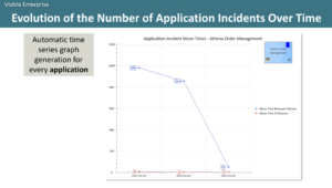
As an example, system monitoring tools can inform Labnaf about the unavailability of applications.
Labnaf can then, for each application, generate a time series graph showing the evolution of the number of application incidents over time.
By clicking on the application, user can start navigating more detailed information about the application, including the processes it supports, its interactions with other applications, its components, its data stores, the technologies is uses, its criticality, whether it is functionally or technically fit, etc.
Consolidated Trends
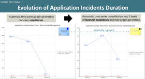
As another example, system monitoring tools can inform Labnaf about the applications’ mean time between failures and their mean time to recover.
Labnaf can then again produce graphs for each application. But it can also consolidate time series data for groups of applications and then produce a set of time series graphs illustrating this consolidation.
Business capabilities supported by the applications can be used as a basis for this grouping. The consolidation and graph generation can then be extended to the top-level business capabilities. If you prefer, you can also consolidate based on processes, operating systems, or application platforms such as SAP or Microsoft Office, etc.
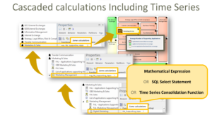
Calculation and Consolidation
Labnaf performs these consolidations using cascaded calculations and consolidations on time series.
Time Series Graph Generation
Dashboards
Labnaf time series charts are organized using dashboards powered by Sparx Systems Prolaborate.

